Twitter overhauls iPhone app with new user interface
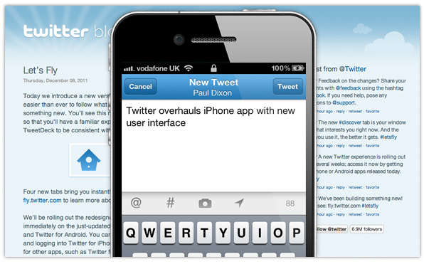
Twitter has released version 4.0 of its iOS application today, and while things remain pretty much the same on the iPad, there’s a brand new experience on the iPhone, with a whole new user interface and more new features.
The company has done away with its previously plain look to introduce a prettier user interface which it promises offers a “faster, simpler way to stay close to everything your car about on your iPhone.” However, it has also done away with some features that many users found very useful.
Screenshots
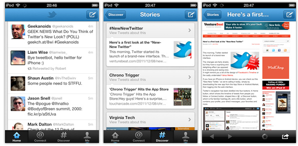
The navigation bar that sits along the bottom of your iPhone’s display is also different. It now houses the Home, Connect, Discover, and Me buttons.
Twitter explains how they work:
Home is where you start from: a personal collection of Tweets from the sources you care about. The Tweet details show rich information such as replies, retweets and embedded images.
Connect is the place to see who followed or mentioned you, retweeted or favorited one of your Tweets. It’s where you keep the conversation flowing.
Discover is where you can tap into the stories and trends people are talking about in your world. You can also find friends, browse interests, and explore hashtags here.
Me puts you and your interests front and center. From here you can exchange Direct Messages with your followers.
It all sounds very nice, until you realize what’s missing. Firstly, the company has done away with the “quick swipe” bar that allowed you to swipe tweets for quick access to the reply, retweet, and favorite functions. You now have to tap on the tweet to be taken away from your timeline. What’s surprising about this particular change is that after removing the quick swipe feature from its iPhone app, Twitter introduced it to its web app for iPhone.
What’s more, there’s no more conversation view for your mentions – they simply display as a list of tweets just like your timeline. The conversation view is still present for direct messages, but those have now been hidden away under the “Me” tab.
It’s not all bad news, however. Users have reacted positively to the new “Discover” tab, which makes it incredibly easy to access trending topics and hashtags, and suggestions on who to follow.
Personally, I like the new look, but I don’t understand why some features have disappeared – in particular the quick swipe bar. However, I’m sure I’ll get used to it, and there will undoubtedly be more improvements to come.
What do you think of the new Twitter app for iPhone?